Our nest – updates on the renovation works. [Part 1]
i know. i have kinda been spamming everyone bits and pieces of the house on IG (and also FB since its crossed posted) and everyone have been asking if i have moved in.
so, i thought an update would be due since the last post on it was in feb. FEB! has it been that long?
honestly, we weren’t the most diligent folks on this renovation thing. we only have the weekends to work on it, sourcing for the electrical appliances, deciding on the plans, working out with the ID and whatever not. It’s really one massive project and i learnt a lot out of this experience. Sure, it could have been better, but a lot of choices and decisions is also dependent on how deep your pocket is.
the husband and me concluded – you can have $ but no taste. but you can have taste but no $ as well.
we (we think), belong to the latter. HAHA!
and so, we did what we could, within our means and what we could afford. if you could recall from the last post, the floors were bare. we didnt take the tiles & room/toilet doors from hdb, so we did the flooring, the ceilings/lightings and some carpentry work. we kept the entire house in a few same basic colors (light wood color, white, grey and some stainless steel in some of the furnishings).
and here’s a virtual tour of the house, starting from the door step!

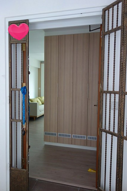
here’s the main door. our unit number is where the heart sticker is currently plastered over. this was not the original view, but we built a huge shoe cabinet to cater to my needs (YAY!) and it also acts a privacy screen so that our interiors are blocked off from unwanted eyes. we also had laminates for the entire house. growing up with a marble floor, i would love that but it is also very expensive and very ‘knock-unfriendly’ on the kids when they fall so we thought this would be a good option. Though i can tell you upfront that they are very hard to maintain as well!

upon entering, here’s what you see on the left. another shoe cabinet (full height no less!) with a hole cut out in the centre for deco/mails/keys etc. it’s also where the switches are, unfortunately (or maybe, fortunately). the kitchen is to the right, we have glass doors for now so everything looks ‘bigger’ and not covered. i am intending to decal the glass with some pretty white stickers so that no one walks into it.

landscape view. I had a full length mirror in the wall facing the entrance to make the entire place look bigger than it actually is. every time i show someone the pictures, they are fooled by the mirror. HAHA.

kitchen. where i rule. I took a very bold attempt and decided to go for louder wood prints to make it stand out a little more, and opted for white cabinets on top to tone down the look. There are glass panels as backing for easy cleaning and all the cupboards/drawers are fitted with the blum system. the bottom of the cardboards are all laced with a stainless steel finish, so we chose a stainless steel refrigerator to match the look.

kitchen lightings. i am a big fan of bright spaces so we installed track lights in the ceiling. they are totally adjustable and i can choose for them to shine anywhere i like! There are also soft lightings hidden under cupboard for the days when i just want to make some milk or take a glass of water to quench my thirst.

the other view from the service yard. I had a huge single sink fitted in because that’s the way i like it. Makes it easier to wash pots and all. My drying rack is also exposed on intention. saves me the hassle from opening/closing it all the time and it’s a drying rack so it dries better while exposed right?
Ok. doing an abrupt end to this post because lunch time is over and i have a full-time job to report to.
keep checking back for more posts on the house in the next few days! I’ll try to post everything before i jet off to sydney this friday!
p.s. do drop me comments or any questions that you want to ask me about the house. I’ll share whatever i can (definitely not my address unless you are a close friend) and hope to be able to give you tips along the way if you are also looking at renovating your place soon!
 |
If you like what you see here.. Do give us a LIKE on cherieladie’s facebook page! |


5 Comments
Anonymous
your house is looking really good! babe..if u dun mind me asking…urs is 4 or 5 room? did u hack any walls for your walk-in wardrobe? i wanted to do 1 like that, but the contractor say no space..unless i do a platform. i think our house layout very similar!
unpolished_gem
yes! make sure you add the frosted sticker on the kitchen door. i didn’t have mine up till 2 weeks later, and one of the contractors walked straight into it. i was so afraid he was going to have a concussion!
cherieladieblogs
I keep my door open for now since i dont have the sticker in place so not that bad. You should be thankful that your glass didnt break when he walked into it! I totally forgot the website that i found long ago when i wanted to buy the decal.. need to go dig dig. where you got yours again?
missgiam
Looks lovely! And so exciting!
cherieladieblogs
Thank you! and yes, we are super excited! Can’t wait to move in there literally!