Our nest – updates on the renovation works. [Part 2]
if you are new reading this blog, you can read about how the house looked like when we first collected our keys and about my previous post on the renovations.
someone asked about my kitchen counter top from the previous post, so i just do a quick mention here.
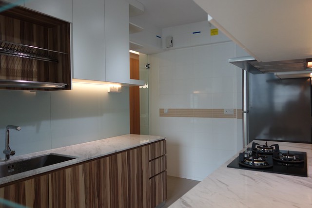
the counter top is marble. i honestly didn’t compare the price for the various type of top but i do know that i wanted a counter top that could last and based on the few material samples that we saw, we chose this. the husband also feels that i should do my sink some justice and give it some mention. haha! errrm. i don’t have a dedicated picture of it but both the sink and the mixer is from franke, and they honestly costed me a bomb (the kind of price tag that no one i know blows this kind of $ at sinks *gulps*).
anyhow, here’s the floor plan so it’s easier for you to understand the layout better. you can also see how the hdb folks has planned the “suggested layout” for all rooms and living area. based on the layout, only our middle bedroom & the kitchen is similar.
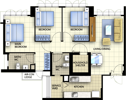
oh. little trivia. if you see the layout above, the sink & the stove is exactly opposite. hearsay (according to superstition) that they cannot be opposite or near each other for fengshui purposes. 水火不容 - water and fire don’t gel together so we shifted ours away. better to be careful than sorry right?

here’s the view from my kitchen door to put things into perspective. the dining area is right behind the shoe cabinet, and the tv console after the dining area. if you notice, there are touches of stainless steel all over – shoe cabinet handles and ventilation holes, dining bench, dining lights etc. they are all part of a deliberate plan to be matchy matchy!
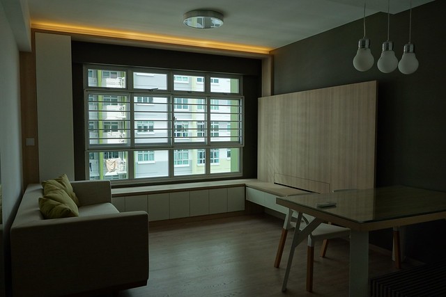
the living room.
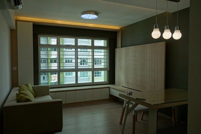
another with the lights on. the main light is also in a stainless steel rim. the place looks a bit dark, and that’s because i was shooting directly against the windows where the sunlight is a little strong so it threw the lightings off.
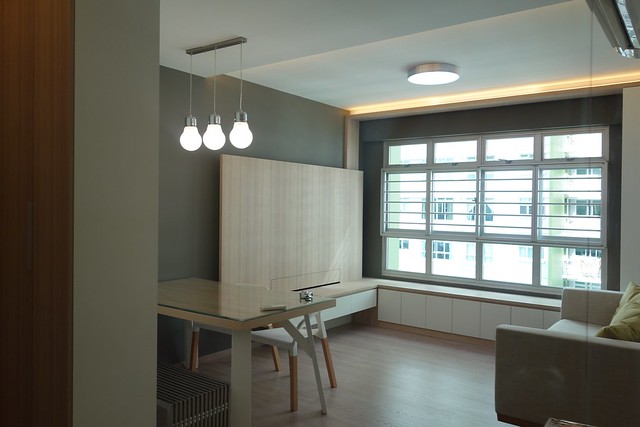
the actual lightings of the house. I love the amount of daylight in the house. This is a mirror reflection in case you are wondering.
we dropped the ceiling in the dining area, built a L-shaped bay window for more storage and sitting area (no space for big sofa!), and deliberately built a frame around the wall with the window to create some depth. and we bought furniture to match the color scheme of the entire place, sandy-colored sofa, wood table with white legs, white chairs with wooden legs and a stainless steel bench to save some space. the bench was an after thought because the space was a lot tighter than we would like it and we wanted to free up some space. (p.s. if you like my white chairs, let me know! i have 2 brand new ones sitting in my store room that i wanna sell!)
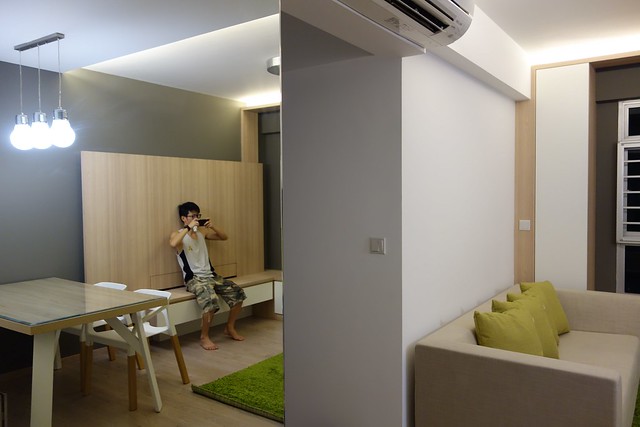
another one of those mirror reflection shots taken one night when we put in the carpet for some pictures.
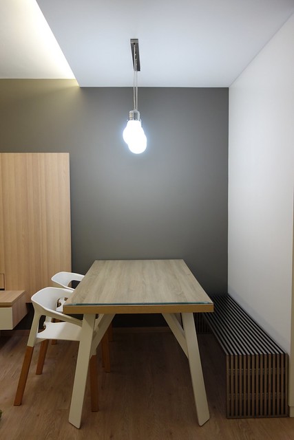
another view of my dining area by the side. while accidental, we really like the mis-matched furniture for the dining area.
the rooms are pretty much unfurnished except for some cupboards. we also deliberately left one of the room entirely empty with the intention of converting it into a playroom.
here’s the mbr room.
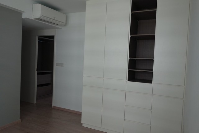

a feature wall is painted in a lighter shade of grey (that’s where the bed would be against). we built a 4 door wardrobe at the corner of the room, and sealed up the entire walkway to the toilet to be a tiny walk-in wardrobe.
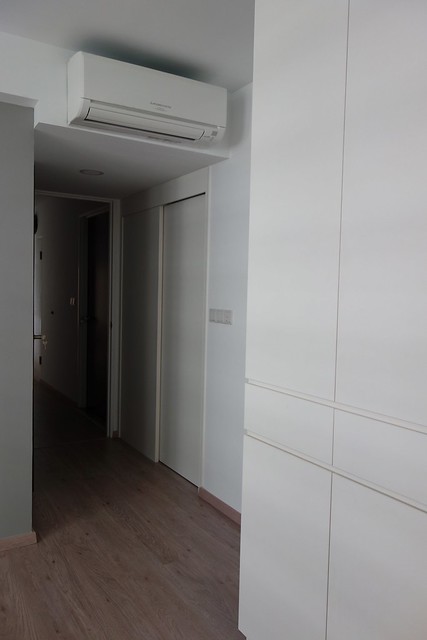
with the door to the toilet and walk-in closet.
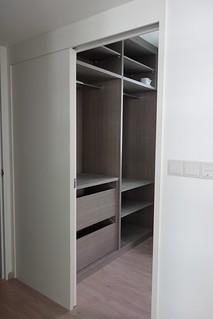

left: with the door opened, right: and a peek inside. my service window is also located here. i love my dining lights so much that i bought a single bulb to be placed here!
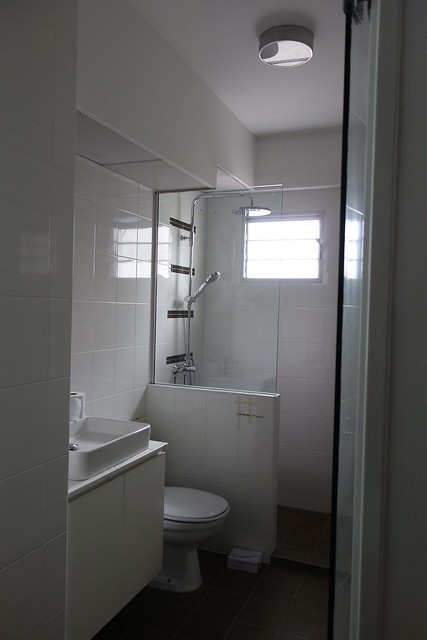
the mbr (master bedroom) toilet. we had the original sink replaced with a counter top rectangular sink, built a half wall/half mirror partition to keep out the shower waters, and a 5cm kerb on the other side to separate dry/wet area. I didn’t want to have full glass partition like most houses have. the vanity top is not done yet. the mirror and the side cabinet is not up yet, and the common toilet looks exactly the same, just without the rain shower.
the master bedroom toilet also have a glass door. i had initially decided to do without a door since i have the main door for the walk-in but eventually put in a glass door, simply to limit the moisture exposure to my clothes/bags. if you notice, we used the same light throughout the entire house, in different sizes.
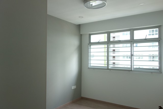
this is the kids’ bedroom. the 2 of them will be sharing a room for sleeping, and its painted the same shade of grey as the mbr. same lights as well. all our rooms are fitted with a main light as well as down lights, mainly because i like the room bright, especially for reading. the furnitures are not in (we havent bought them yet tho we already know what we wanted).

the bedroom also has a 4-door wardrobe for the kids to share.
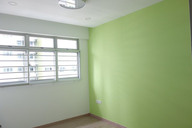
last room – playroom. we had wanted to paint this room a pale blue but decided that a burst of bright green evokes a more playful mode. this room is totally empty save for the green feature wall we painted on one side.
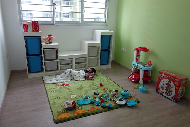
days later, we transformed it into this! cupboard from ikea to store all his toys! this kid has way too much toys! whatever you saw here was just the tip of the iceberg. we brought this over for him to keep himself entertained while we go about our chores of cleaning the house up.
and yup! that’s the end. there’s really nothing interesting about the bomb shelter.
DO tell me what you think! We have yet to set a date for the big move but are slowly bringing in a little of our stuff bit by bit every time we visit. Save for the bed and our clothes, i think the house is in living conditions already! Am super excited about the impending move!
i’ll probably do a post on what i learnt during this entire renovating experience! meanwhile, it’s almost 2am while i am still drafting this post and its really time i head to bed.
 |
If you like what you see here.. Do give us a LIKE on cherieladie’s facebook page! |
9 Comments
binique
oh..from the floor plan. i think i know now. you have a space beside the bathroom. 🙂
unpolished_gem
our places are quite similar! but i like that little walk-in you have, without having to sacrifice space like mine!
cherieladieblogs
Ya, it’s kinda like a wasted space if i dont convert into a walk-in so might as well build a door at the front so at least if there is mess, i can just close the door and not think! LOL.
Anonymous
LOL. Positivism! The floor is quite alright, it’s a rough surface so not that bad. i’m more afraid of the marble floor right outside the toilet. He slipped a few times on that.
diana_lee
Like like like!!
cherieladieblogs
Thanks thanks thanks! Your posts are pretty infrequent these days! must have been very tiring for you (i soooo can imagine). Hang in there and hey! Like 9 months after, i havent had the chance to meet you! 🙂
cherieladieblogs
I just whatsapp you!! LOL.
summerhues
beautiful! Overall feel – very MUJI. Nice!
cherieladieblogs
Thanks! LOL. I’m a fan of MUJI by the way. 🙂